Hi everyone,
We are trying to create an email template with a row consisting of 3 columns. Each column should have a 1x1 picture, headline and text.
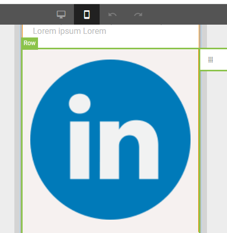
In Desktop I managed to get that every picture is in full width over the column, however in mobile Sugar crops the image and it is not full width. See images:
Desktop:
Mobile:
Does anyone have any idea how I can get the image to be over the whole width?
It seems to work fine, when I use two rows.
Desktop:
Mobile:

